.gif)
Your HLabs guide to leveraging digital storytelling on Webflow
Interactive storytelling – why is it revolutionary?
Interactive storytelling is the art of strengthening stories with innovative digital techniques – it’s all the rage in digital marketing right now, and for good reason.
Let’s be honest. In the current chaotic digital age, no one’s going to trawl through blocks of dull, generic content on websites. Using interactive storytelling means you can deliver information to your audience while connecting deeply with them and building trust. Sounds way better, right?
Interactive websites come across as much less pushy because they effectively build more authentic connections with visitors. You’re telling a colourful story that your users end up becoming immersed in and staying hooked on for longer.
Whilst we’re specialists in designing interactive content on multiple no-code platforms, in this blog we’re looking specifically at Webflow!
So how do you achieve interactive storytelling on Webflow?
Animations for interactive content are key to engaging users
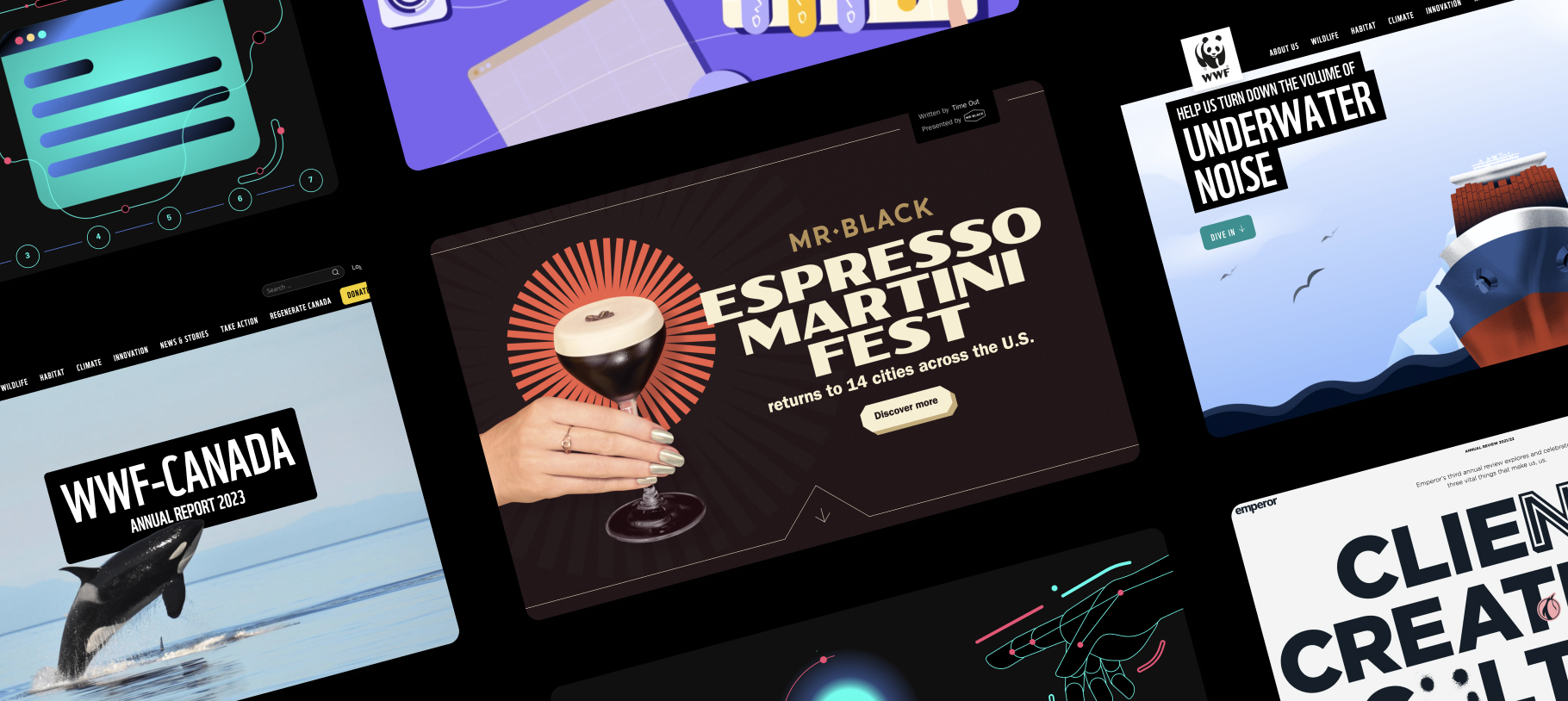
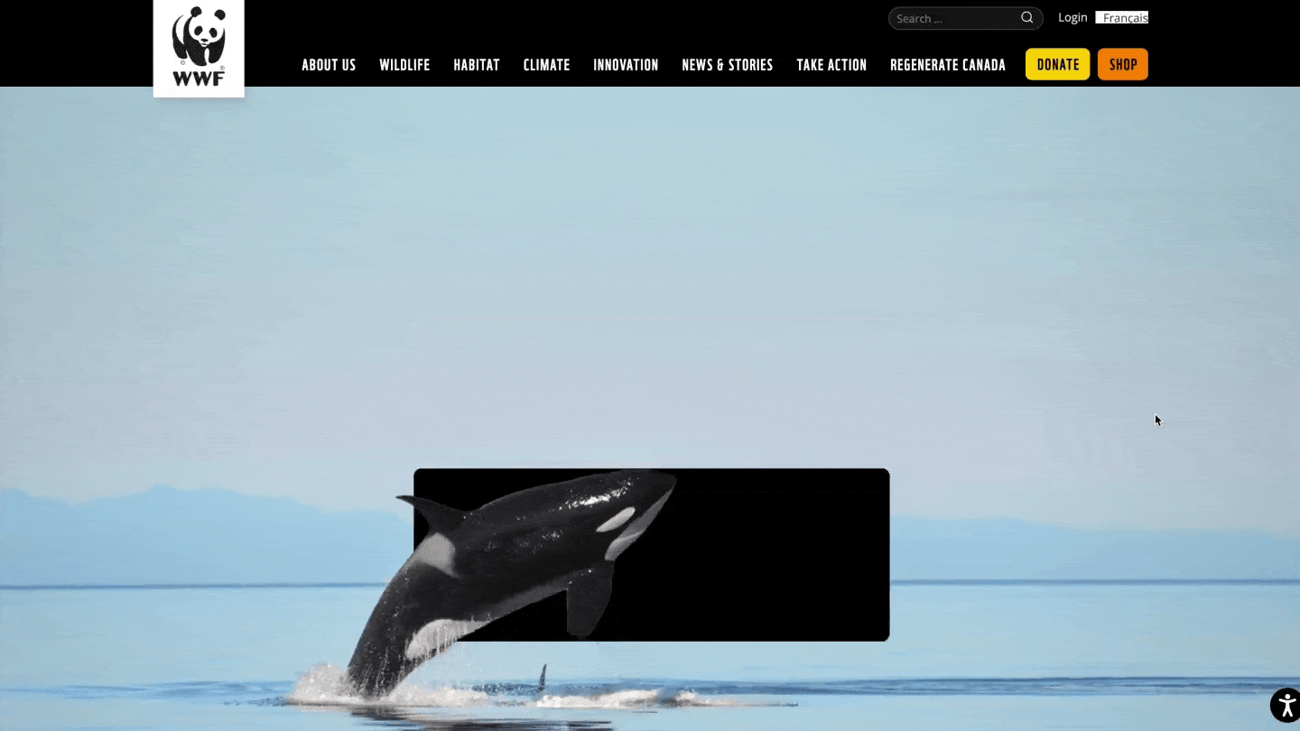
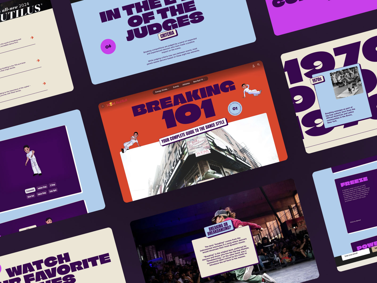
Our 11 favourite digital storytelling techniques on Webflow
1. Illustrated animations
Well-implemented animations can do wonders for your user engagement and even increase conversions by more than 80% – they can help you encourage clicks and provide a better overall user experience.
Animations are also a fabulous opportunity to add more personality to your site. Who said buttons can’t be powerfully on-brand? Try animating your loading sequences or adding graphical transitions to catch your users’ attention where they least expect it. You’ll see, it’s quite addictive!
However, not all illustrated animations are created equal. It’s tempting to want to animate everything on your website, but it’s more important to focus on effectiveness. Ineffective animations will crowd your website and make your users hella irritated…
Your site animations should always add value, emphasise the important elements or guide your users. Animation without purpose is super frustrating to users and can create page load time issues, so you’ll want to avoid animations whose sole aim is the wow factor.
2. Scrollytelling
Scrollytelling is an incredible tool for simplifying user experiences – it lets visitors dive deep into websites to discover rich stories. If you use scrollytelling on your site, you’ll notice users spend a lot more time there and share your content down the line. What’s not to love?
It will also allow you to introduce position-triggered multimedia events with dynamic text, visuals and sound. The technique lends itself perfectly to curating a real sense of narrative throughout your page. Give it a try!
3. Parallax scrolling animation
Parallax scrolling animation is a funky way of creating depth and dimensionality for truly immersive digital experiences. This basically means that the pixels on your webpage no longer appear flat because the foreground moves differently from the background – this enriched motion in turn wildly enhances your user experience.
What’s more, users will feel more autonomous in their exploration of your website because they can fully control the pace of content revelation.
Make sure your parallax scrolling naturally guides users through your content, so you don’t confuse visitors with unfamiliar patterns, or overwhelm them with too many moving elements. Also, parallax scrolling can affect page loading speeds – use it sparingly to avoid poor site performance scores.
4. Long-scrolling
Long-scrolling is a design pattern that gives users the sense of scrolling infinitely down the page. We’ve all come across it on social media, blogs or news sites.
One of the reasons we love long-scrolling is for how much it enhances user engagement. It keeps your visitors staring at your page for longer by removing the need for them to click anywhere to keep consuming content. It also has the added benefit of constantly loading new URLs which is terrific for boosting your SEO with more page views.
Watch out though – a long scroll tends to incur psychological costs for users like information overwhelm or difficulty in finding specific information. It doesn’t bring that sense of completion users get when they reach the bottom of a page. Our tip is to use plenty of headers and visual cues so you don’t disturb visitors’ sense of content hierarchy too much.
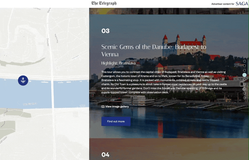
5. Horizontal scrolling
This one’s for you if you want to shake things up where your users least expect it: horizontal scrolling. It’s a navigation method that reveals content from the sides of your site pages using mouse actions, touch gestures or arrow keys. This technique is especially awesome for showcasing images and interactive content.
Consider spending time thinking up effective visual cues like arrows, text or mouseover scrollbars. This can improve the UX in case your users expect (or are used to) vertical scrolling, it'd remove additional thinking for them to locate the scroll bar and understand the interactions on the page.
It’s also a good idea to not use horizontal scrolling across the whole page so that you don’t alienate users.
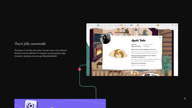
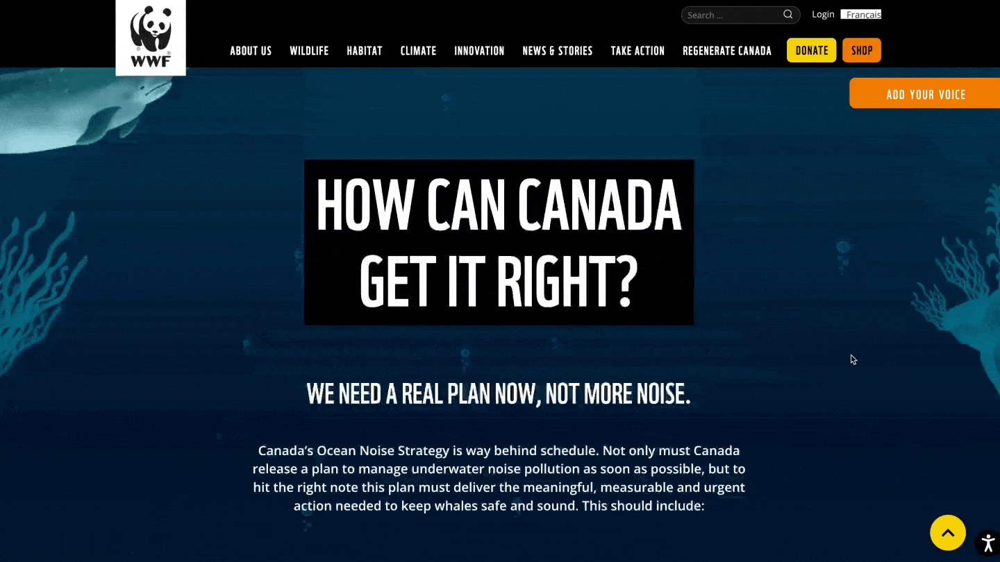
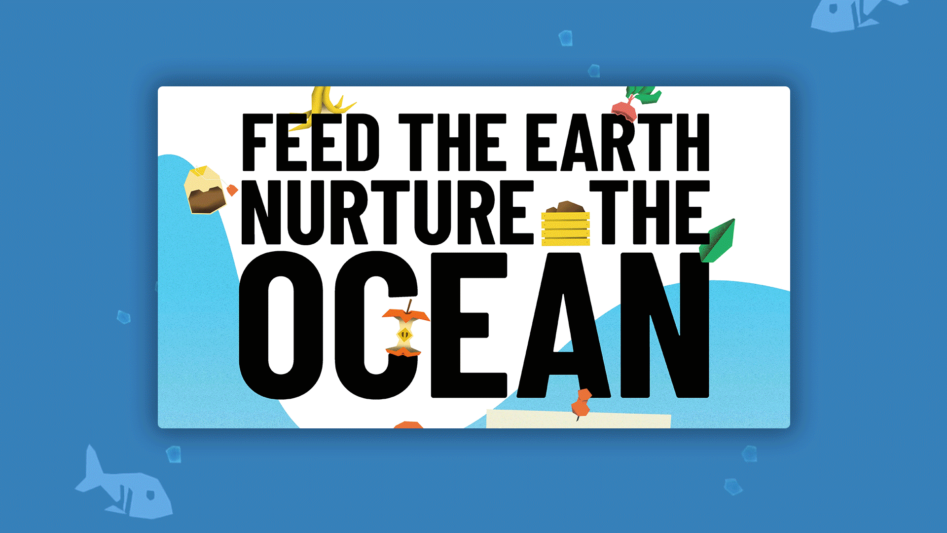
6. Visuals instead of text
Data storytelling is a game changer, and brands’ digital success now hinges on their ability to tell data-driven stories. Visuals are processed 60,000 times faster than text, so using them across your site is remarkably powerful.
Here are some more mind-blowing stats for you: users are 80% more likely to engage with content that has meaningful images – visuals stimulate site visitors’ brains by appealing to the cognitive functions needed for emotional connection. And you’ll be able to tap into 7 times more engagement if you craft your own imagery.
Want to leverage this? Try background images, videos, slideshows, and infographics so that your users remember your content for longer and understand it a lot more effectively. Typography and iconography are also great to help make your message stand out.
7. Hover to reveal
Hover effects describe all the changes that can be triggered when a user hovers their mouse over an element of your website. This can range from colour or size changes to more in-depth animations. These hover effects allow users to interact with your site elements and give them a super satisfying sense of control.
Hover to reveal interactions have other benefits like:
- Adding depth to your website
- More engagement
- Drawing attention to the most important elements on the page
- Guiding user interaction
- Providing additional information
- Reducing clutter on your website
But it’s important to use them sparingly so you don’t distract your users. Make sure every hover effect you use adds value to the user experience, and make them consistent across your website. Don’t blindside visitors halfway down the page – users should know what to expect throughout.
You can go the extra mile and use swipe or tap gestures for other devices to keep everything optimised on smaller screens.
8. Animated charts
When you think about the fact that you retain 10% of what you hear, 20% of what you read, and 80% of what you see, it’s crazy not to try and reduce static text on your page.
We’ve got a few tricks up our sleeve for more information retention, but our favourite technique is animated charts which are especially useful when it comes to complex data. They allow you to break down data, giving users more time to understand the information.
You can animate all sorts of different types of charts, like racing bars, line charts, time sliders, pie charts, illustrated maps, and more… The sky’s the limit!
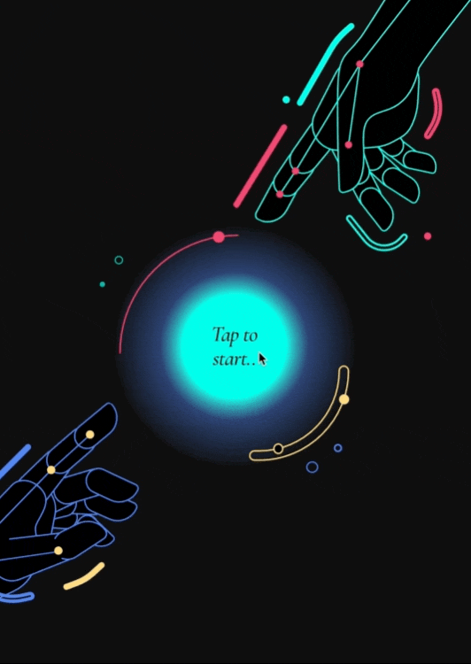
9. Hotspots
Hotspots are minimalist elements designed to grab your users’ attention without overwhelming them. You can use them for lots of different purposes – to provide additional information, offer more detail or highlight key messages.
Make sure you stick to short copy for your hotspots and carefully plan your placement for optimal user interactions. You can also level up your hotspots with motion effects, images and videos. We love designing hotspots with contrasting colours so they stand out, and we’re mindful of never blocking important on-page elements with them.
Quick tip: leverage analytics to track how well your hotspots are performing and adjust accordingly.
What’s a Rich Text element?
The rich text element allows you to create and format headings, paragraphs, blockquotes, images, and video all in one place instead of having to add and format them individually. Just double-click and easily create content.
Static and dynamic content editing
A rich text element can be used with static or dynamic content. For static content, just drop it into any page and begin editing. For dynamic content, add a rich text field to any collection and then connect a rich text element to that field in the settings panel. Voila!
How to customize formatting for each rich text
Headings, paragraphs, blockquotes, figures, images, and figure captions can all be styled after a class is added to the rich text element using the "When inside of" nested selector system.
10. Pop-ups
Just like hotspots, pop-ups can grab your users’ attention. They’re great for collecting user data or helping them locate crucial content. They’re amazing for offering important info that visitors might otherwise miss.
Do be careful that you don’t excessively use pop-ups or you’ll risk distracting users from the action you want them to take. Sometimes other elements like splash screens are more appropriate.
Not pointing any fingers, but a poor use case for pop-ups is welcoming users – it just frustrates and leads them to click off the page. Stick to scenarios where your users are about to perform irreversible actions and limit pop-ups to critical info only.
11. Soundbites
We all know that music can provoke huge emotional responses. Soundbites tap into this by activating neural pathways that create memories and feelings for immersive digital experiences that your users won’t forget any time soon!
When they’re used effectively, soundbites can make alerts and notifications into fabulously interactive responses. They’ll help your users retain information by catering to more auditory learners.
Make sure you stick to a thoughtful approach to soundbites and always consider the context. A good practice here is to provide really clear options for users to control the sound so that it doesn’t create shock or frustration. Sound can be quite invasive, so also consider your audience’s varying tastes and preferences.
Ready to elevate your content with these digital storytelling techniques available to you on Webflow?

We’ll show ours if you share yours.
Share your details so we can stay in touch and directly show you premium HLabs content!