.gif)
How our interactive story showcased one of Red Bull’s most daring projects of 2023
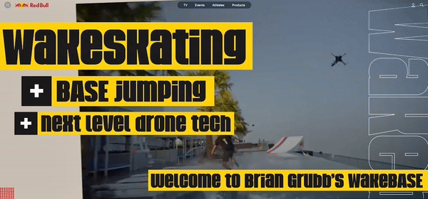
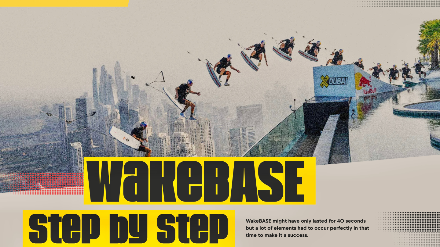
In December 2023 Red Bull’s WakeBASE video dropped on social media and was instantly viewed millions of times around the world.
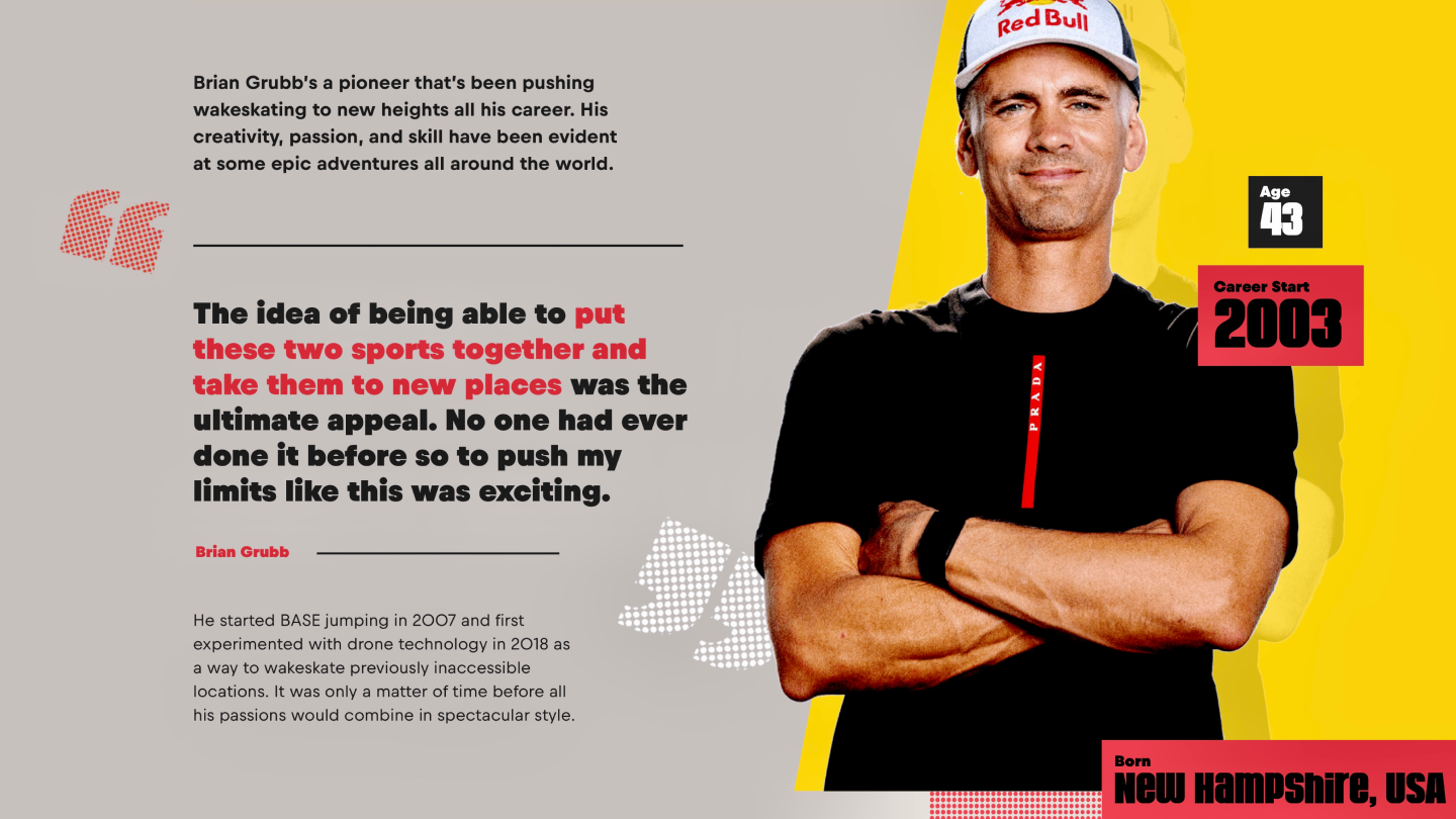
The project saw long-time Red Bull athlete Brian Grubb wakeskate behind a custom-built drone in an infinity pool 77 floors up in the sky before hitting a jump off the side of the building and BASE jumping to the beach below. Pretty impressive, right?
HLabs were stoked to be involved in a global project of this magnitude and our brief to create an interactive experience that explained exactly how the stunt unfolded and introduced the key characters involved was one the team couldn’t wait to jump (awful pun, we know) into.
For this one we’d be writing, designing, and building the story on our partner platform Ceros in advance with it being published on Red Bull dotcom soon after Brian had touched down and packed up his parachute.

Brian's quotes, alongside concise and straightforward sentences, bring clarity to this piece

Here’s 10 ways that helped us showcase WakeBASE and maximise digital user engagement on Ceros.
1. Making the video centre stage
The first thing you see when you click the link? Brian Grubb leaping off a kicker into thin air. You only get two seconds to engage someone, so we clipped up the key moment into a rolling hero gif. No matter how many times you watch it, it’s still jaw-dropping! To help drive traffic to the full video, we housed it just below complete with a custom play button.
2. Prominent section headers
While the jump only took 40 seconds, it was a decade in the making which meant there was a considerable amount of content and information to include. We broke the story down into clear and digestible sections complete with giant headers to help readers navigate between each part of the page with ease.
3. Step by step explainer
The biggest challenge was how to clearly break down every step of the stunt from the drone’s engine whirring into life, all the way to the landing. For this, we worked closely with the Red Bull team to put some questions to Brian so he could pinpoint exactly what would be happening during the 40 seconds. Each of the eight steps had a number, header, image, explainer text, and quote from Brian to really provide the detail on how something that had never been seen before became reality.
4. Concise copy
Instead of long paragraphs, we stuck to short, sharp sentences that were digestible and straight to the point. We also included a bullet point section to clearly explain the initial vision of the project and used as many direct quotes from Brian as possible. Who better to explain the project than the man actually doing it?
5. Highlight quotes
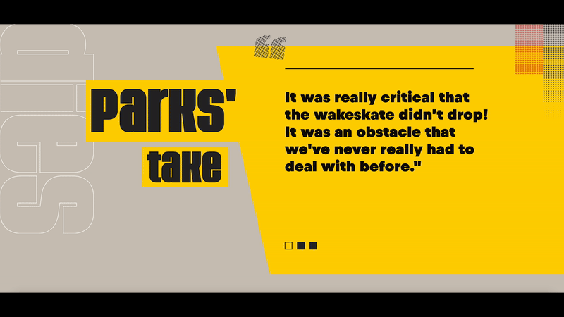
Making a selection of really strong and informative quotes from Brian, the drone pilot, and his training partners stand out on the page by putting them in bold with custom quotation marks helps draw attention to some of the really crucial and personal parts of the project.
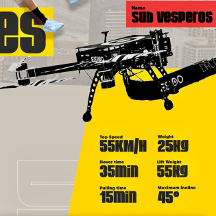
6. Data visualisation
Continuing on the same path, information like technical data around the drone, athlete bios, training dates and location facts were all displayed separately from the body copy which provided added clarity and made them easier to consume quickly.
7. Hover states and carousels
Easily accessible hover states and rolling carousels displaying key quotes enabled us to include additional vital copy without compromising the length of the page and making it feel cluttered.
What’s a Rich Text element?
The rich text element allows you to create and format headings, paragraphs, blockquotes, images, and video all in one place instead of having to add and format them individually. Just double-click and easily create content.
Static and dynamic content editing
A rich text element can be used with static or dynamic content. For static content, just drop it into any page and begin editing. For dynamic content, add a rich text field to any collection and then connect a rich text element to that field in the settings panel. Voila!
How to customize formatting for each rich text
Headings, paragraphs, blockquotes, figures, images, and figure captions can all be styled after a class is added to the rich text element using the "When inside of" nested selector system.
8. Utilising all available content
Having access to the very initial project sketches added something really unique to the page. Combining the behind-the-scenes unseen drawings with the final professional imagery was a great way to show how the project was successfully brought to life.
9. Bold typography
The use of bold typography in combination with the page’s unconventional layout helped us display Brian’s pioneering spirit and created high contrast between all the different content forms that make up the story.
10. Consistent art direction
Taking inspiration from the initial American comic book style project sketches helped us ensure the experience stayed true to the original vision of WakeBASE. Thanks to these references we were able to incorporate into our design things like strong graphics, halftone patterns, rough paper textures, and high contrast colour to create a highly eye-catching and stimulating experience, much like the stunt itself.
Let's chat!

We’ll show ours if you share yours.
Share your details so we can stay in touch and directly show you premium HLabs content!