.gif)
7 interactive techniques we used to improve WWF's storytelling
In two years working with WWF we have used multiple techniques to improve their digital storytelling to raise awareness, promote campaigns and increase signups to petitions. We've used no-code technology such as Vev, Webflow, Juxtapose, Lottie Files as well as uplifting visuals with illustration, specific art direction and interactivity to enhance the media. This article looks at how techniques like 'scrolly-telling', data visualisation and animation increase engagement.
When you can't photograph: illustrate it.

Technique 1: Use illustrated animations
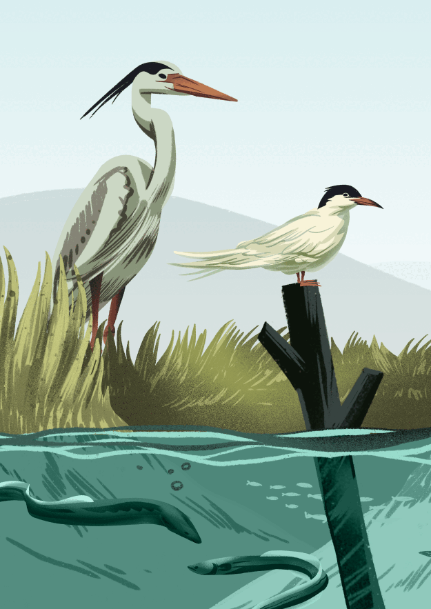
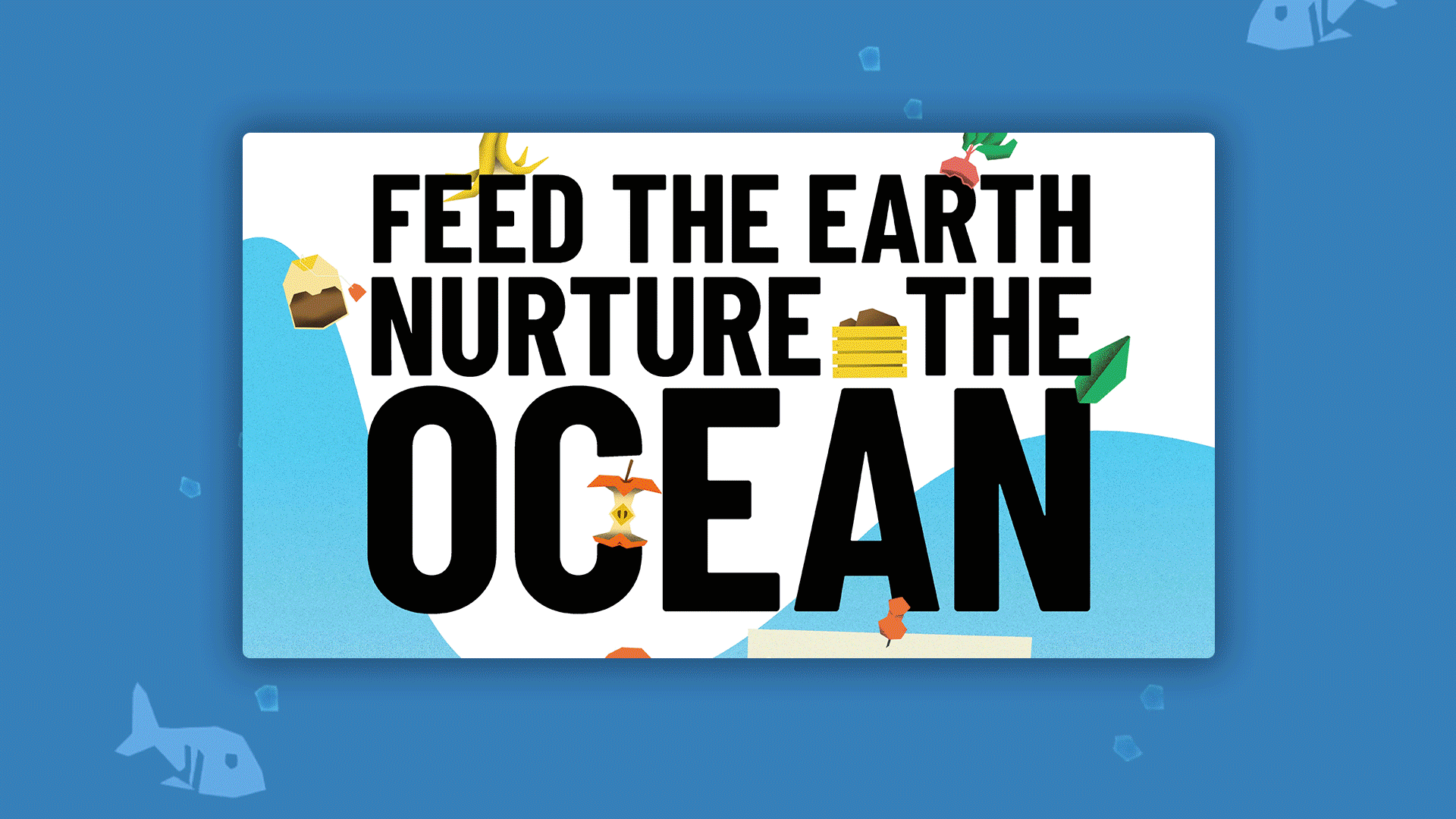
Illustrations are crucial for nonprofit brands and campaigns as it can evoke unique emotions, reflects brand personality, and sets special initiatives apart when no photography is available. Illustration promotes inclusion and representation, particularly when sensitive or challenging subjects are involved. Using illustrations in content marketing offers clear benefits: they attract attention, increase brand recognition, engage audiences, simplify complex information, and cater to different learning styles.
Our in-house illustration team at HLabs has really enjoyed utilising illustration for almost all the WWF projects we've launched so far. See how Alexandru Savescu, our illustration director did it here.
Animation breathes life into digital stories instantly. It can be easily incorporated using no-code tools, such as embedding vector Lottie animations or adding custom animations to illustrations and text as autoplay MP4 files. Regardless of the method, movement effectively captures the audience's attention, emphasises key points, and maintains engagement. Animation adds a touch of magic to any story.
Technique 2: Embrace 'scrollytelling'
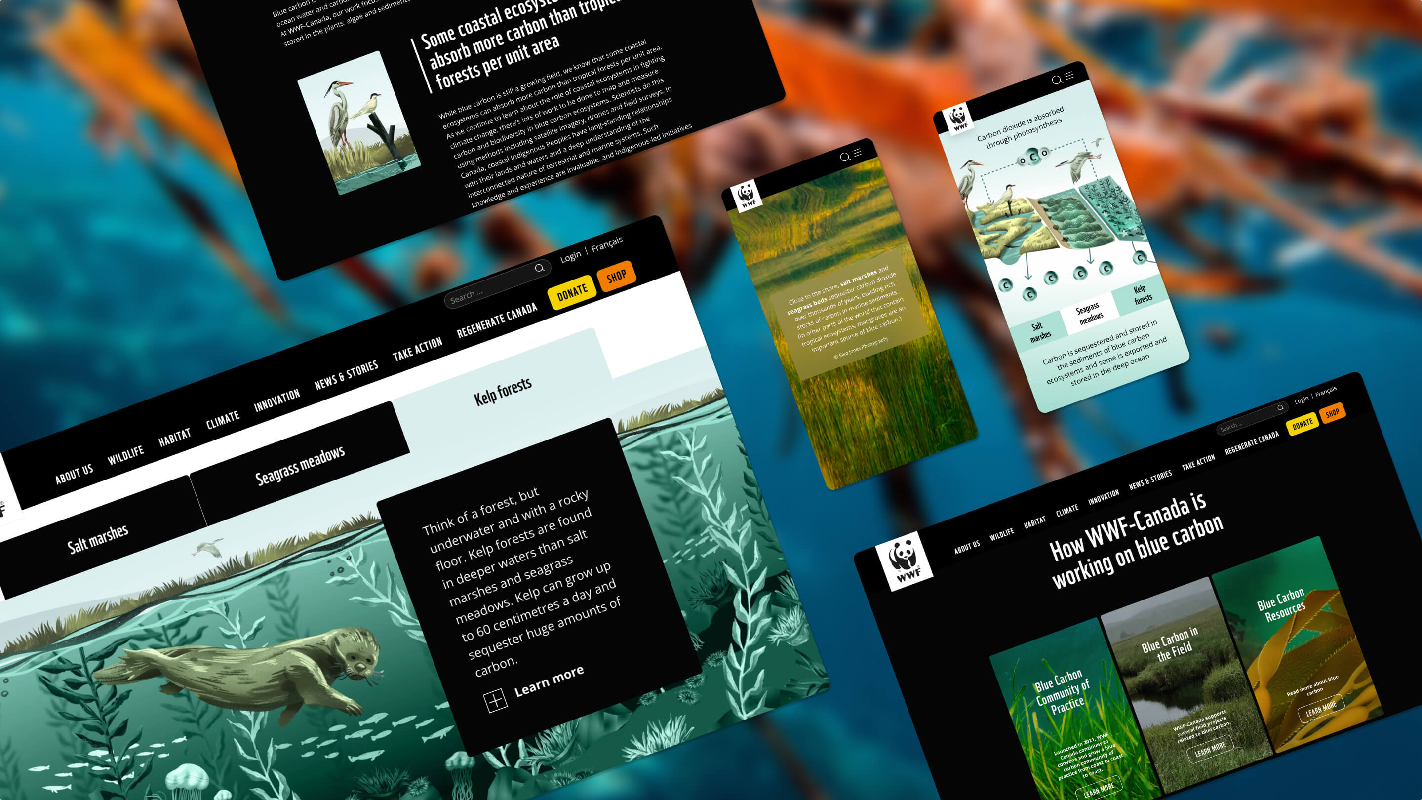
Scrollytelling video techniques refer to the use of interactive and dynamic videos that unfold as the user scrolls down a webpage. These techniques can significantly enhance engagement on a website by immersing users in a captivating visual narrative. By integrating compelling storytelling with seamless scrolling, scrollytelling videos create an immersive and interactive experience, holding users' attention and encouraging them to explore further. The fluid progression of content and the element of interactivity make scrollytelling videos a powerful tool for capturing and retaining user interest, leading to increased engagement and a memorable browsing experience. We used this technique to great effect on the Blue Carbon campaign showing the impact of seagrass.
View WWF's 'BlueCarbon' Campaign
Technique 3: Encourage users to 'tap that'
Hotspots, tabs, and clickable objects are interactive elements that greatly enhance website engagement. These features transform static objects into compelling interactive components, allowing users to explore and interact with the content. Hotspots enable users to click on specific areas, revealing additional information or images. Tabs organize content for easy navigation, while clickable objects like buttons provide instant access to actions or relevant information.
These interactive elements create a sense of control, encouraging users to stay longer, explore further, and actively engage, thereby enhancing the overall user experience and increasing engagement levels.
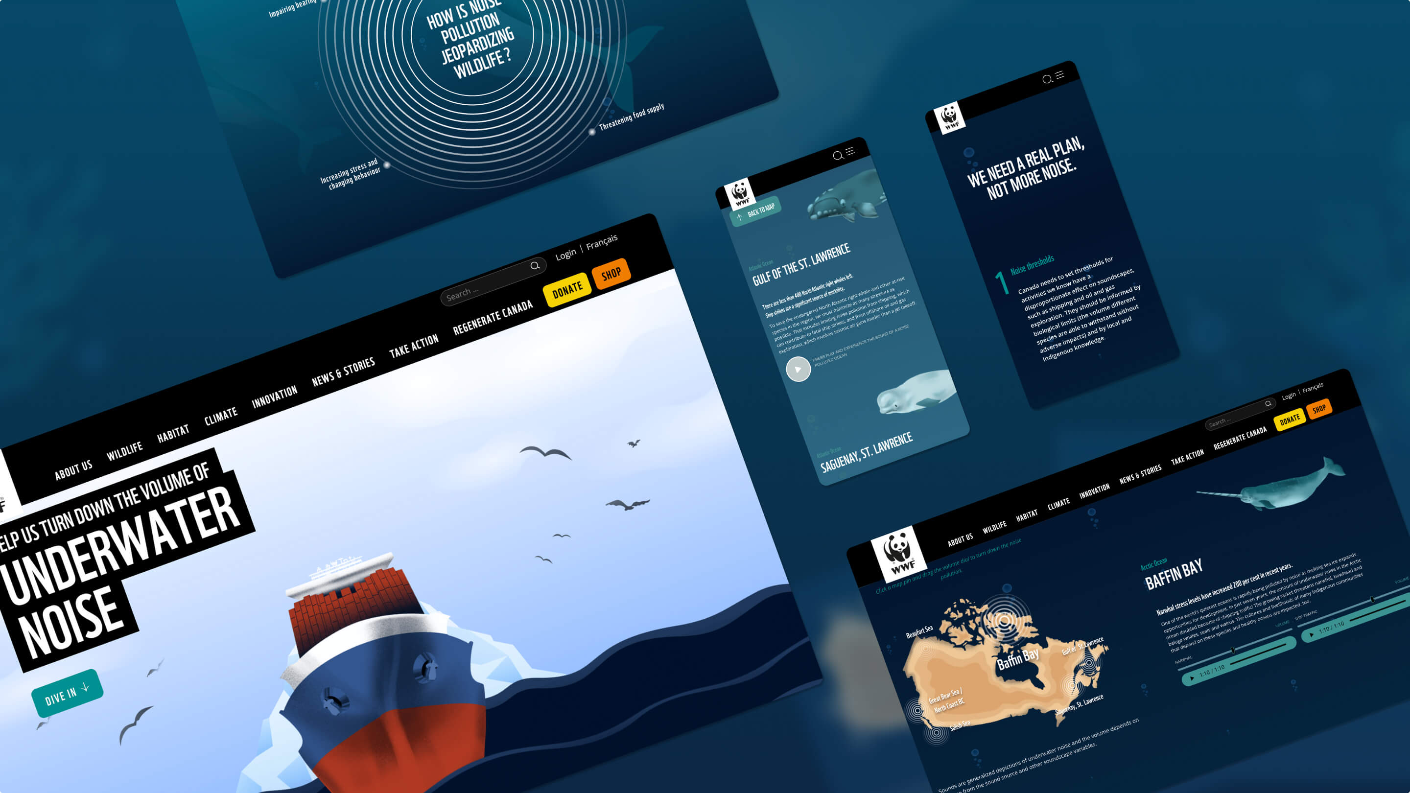
Technique 4: Introduce audio
Sound bites capture attention and convey information succinctly, while Spotify playlists create an atmosphere and cater to users' interests. Interactive audio elements enable active engagement and unique exploration. By incorporating these audio features, websites engage users on multiple sensory levels, resulting in enhanced enjoyment, memorability, and interaction, ultimately leading to increased engagement.
We used interactive sound components to compare whale recordings to juxtapose against the underwater noise pollution from boats and machinery to great effect in the following campaign. We encourage you to try it!
View WWF's 'Underwater Noise' campaign

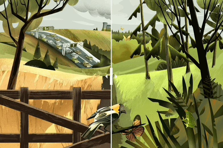
Technique 5: Slide into success
Interactive image comparison sliders enhance engagement by presenting a "before vs after" scenario. When two static images are placed side by side, our eyes tend to focus on the second image, overlooking the first. However, with interactive sliders, both images receive equal attention, effectively conveying the core message and capturing users' engagement.
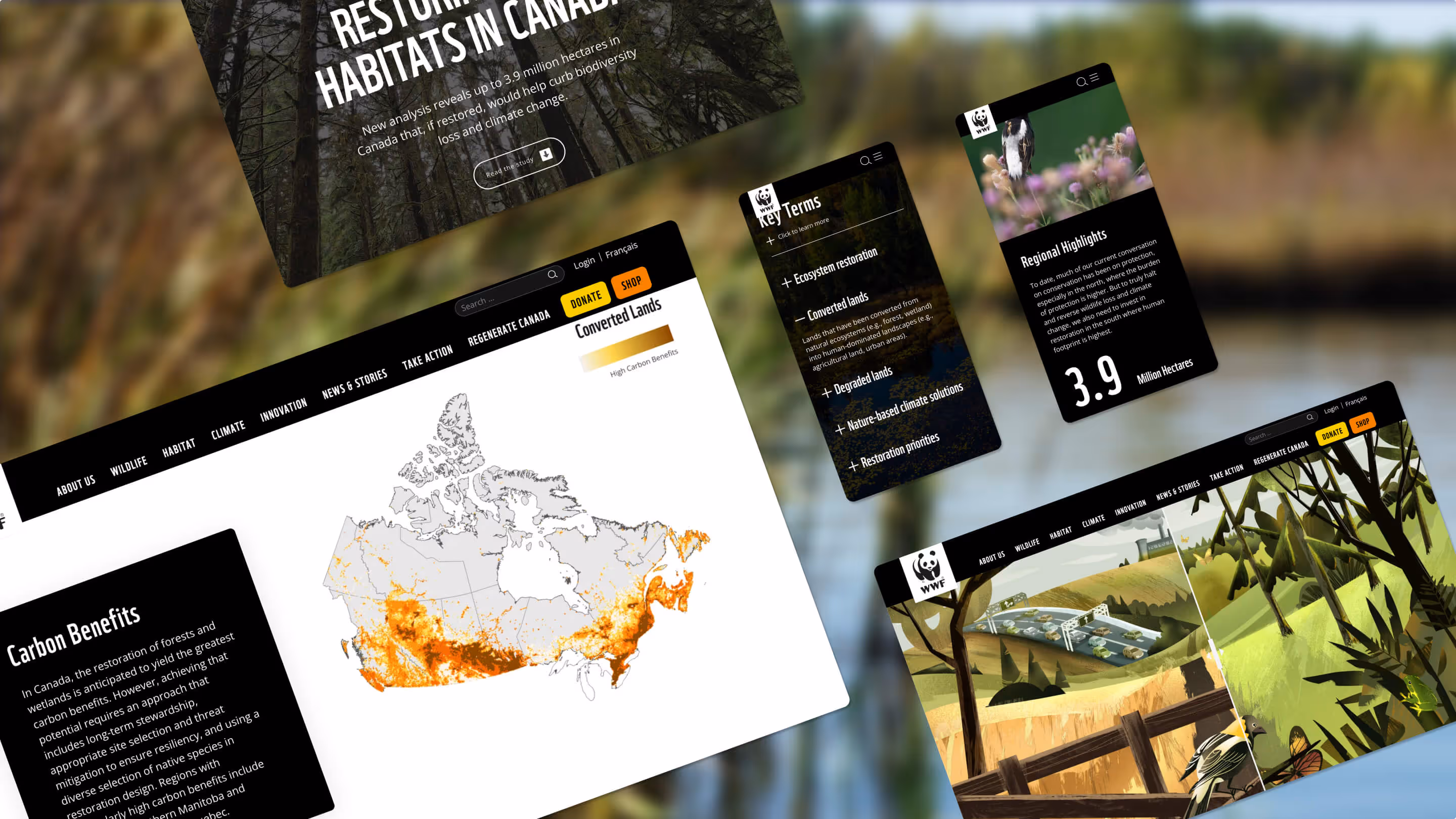
Technique 6: Map data to a location
Have some geographic or location-based data? An interactive map is a data visualization idea you need to try. It actively encourages users to explore and interact with geographical information, enabling them to zoom in, pan, and interact with various elements on the map. This hands-on approach promotes engagement and empowers users to discover personalized details or points of interest.
Data visualization on maps, such as heatmaps or thematic layers, presents complex information in a visually compelling and easy-to-understand manner. This not only enhances the aesthetic appeal but also enables users to grasp patterns, trends, and insights effectively.
In WWF's 'Restoration Analysis' and 'Underwater Noise' campaigns we used sticky maps to great effect.
View WWF's 'Restoration Analysis' campaign
What’s a Rich Text element?
The rich text element allows you to create and format headings, paragraphs, blockquotes, images, and video all in one place instead of having to add and format them individually. Just double-click and easily create content.
Static and dynamic content editing
A rich text element can be used with static or dynamic content. For static content, just drop it into any page and begin editing. For dynamic content, add a rich text field to any collection and then connect a rich text element to that field in the settings panel. Voila!
How to customize formatting for each rich text
Headings, paragraphs, blockquotes, figures, images, and figure captions can all be styled after a class is added to the rich text element using the "When inside of" nested selector system.
Technique 7 - Immerse your audience with parallax animation
Parallax scrolling websites play with space and depth, yet technically speaking this design technique is actually a lot simpler than it may seem. Most parallax scrolling websites simply move content in the foreground at a faster rate than content in the background. Through this juxtaposition of movement, parallax scrolling websites create the illusion of three-dimensional space. It can really enhance the overall user experience of a website, livening up a design with motion and enhancing its interactivity. When people see that scrolling doesn’t move everything in one fixed block, but rather touches multiple elements, they feel more in control over how they experience a website.
How many of these techniques are you already using? Need some further advice on how to tailor these ideas to your content?

We’ll show ours if you share yours.
Share your details so we can stay in touch and directly show you premium HLabs content!